Overall description of Data Source
This data source is the “Employment-to-Population Ratio” over time in the U.S. The data begins in 1979 and ends in 2022. The data set also provides annual updates. The data is taken from the Economic Policy Institute and the Federal Reserve Bank of St. Louis.
Visualizations
Below you will find visualizations that model employment rate data in the United States. Each graph has corresponding descriptive titles and insights located below the image.
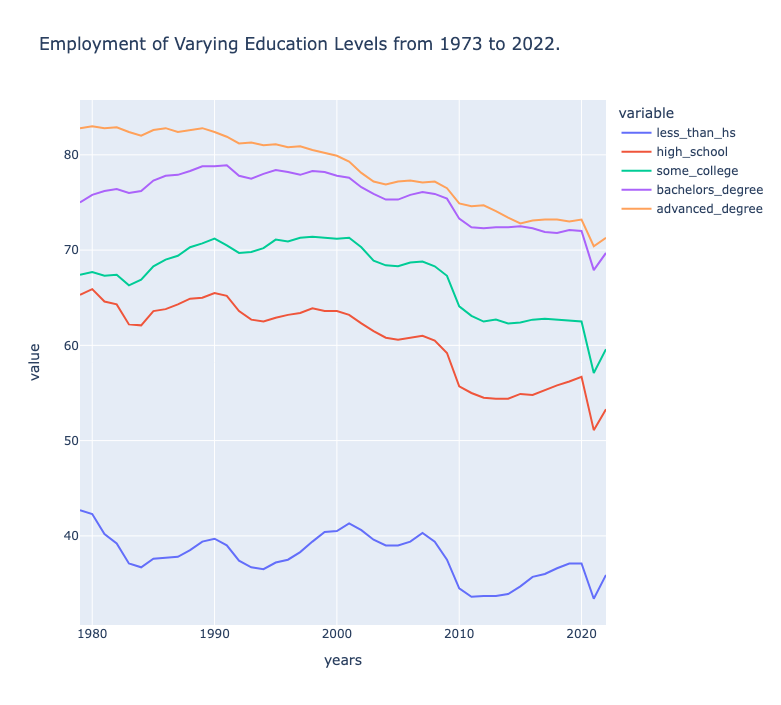
Employment Rate by Education Level Overtime
Click here to view full interactive visualization!
Insights:
As expected, people with a higher level of education have a higher employment rate. We were surprised
by the large gap between those with a less than high school degree and the rest of the education levels.
It is interesting to see that the employment rate for those with a bachelor’s degree and an advanced
degree are very similar – this shows that having a post-secondary degree in general is the determining
factor for high employment.
viz_embed.png)
Pie Chart of Employment Rate by Education Level for First Year Data (1979)
Click here to view full interactive visualization!
Insights:
This visualization shows the percentage of people employed, distributed by their level of education.
The workforce mostly consists of people with a degree, but we were surprised to see how a large
percentage of the workforce includes people with less than a college degree. This shows the importance
of labor; no matter the education level, people are needed in the workforce.
viz_embed.png)
Pie Chart of Employment Rate by Education Level for Last Year Data (2022)
Click here to view full interactive visualization!
Insights:
The distribution of employment has stayed relatively the same since 1979, with a minor increase
in the number of people with a post-secondary degree; this increase could be due to the increase
in white-collar jobs in the workforce. Otherwise, it would make sense that the percentage of
employed people increases as the education level increases.
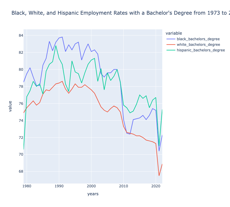
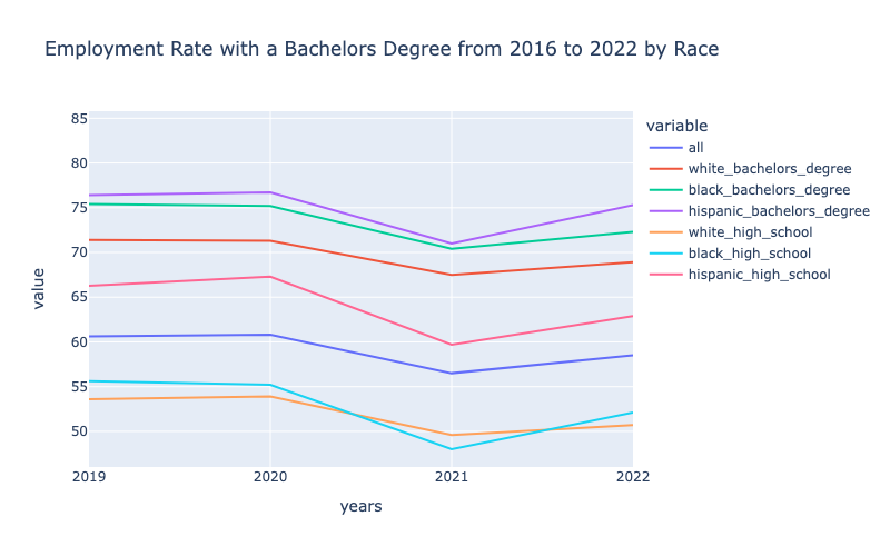
Employment Rate of Individuals with Bachelor's Degrees by Race
Click here to view full interactive visualization!
Insights:
In general we were surprised by this visualization and display of data. Due to a history of
systemic racism in America, we expected the employment rates for White individuals to be the highest,
but it was actually the opposite; the highest employment rate tends to be Black individuals with a
bachelor’s degree, then Hispanic individuals with a bachelor’s degree. We are not certain on the
reasoning behind this, but it is an interesting insight. We were also surprised by the major fluctuations
over time. There is a lot of variation in employment for different races, and not all peaks and troughs
happen during the same time period.
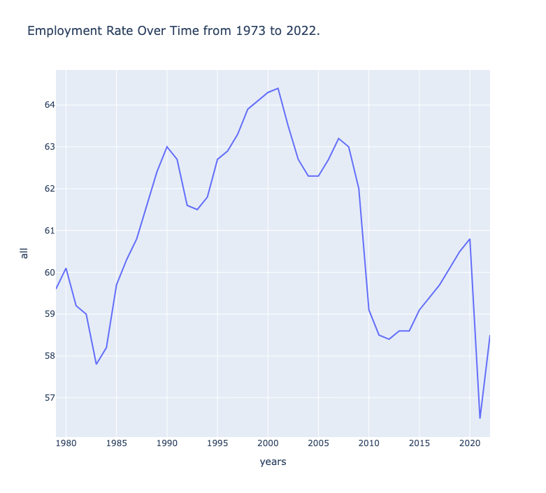
Average Employment Rate Overtime
Click here to view full interactive visualization!
Insights:
The average employment rate over time shows how the employment rate majorly fluctuates with events
in current history. There are major peaks and troughs, displaying times of economic growth and
struggle. Specifically, we expected a dramatic decrease around the housing crisis of 2008 and
Covid around 2020, which is represented well in the visualization.
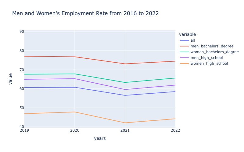
Effect of Covid-19 on Employment Rate by Gender
Click here to view full interactive visualization!
Insights:
This graph displays the time frame that could be potentially affected by COVID-19. We wanted to
see if men or women took more of a dramatic hit due to the pandemic, but both genders tended to
decrease at a similar rate. The employment rates for men and women with a high school degree
both decreased more than those with a bachelor’s degree.
Effect of Covid-19 on Employment Rate by Race
Click here to view full interactive visualization!
Insights:
In this visualization, we emphasized the differences between the employment rate of race and
level of education during the pandemic. Most of the demographics decreased at the same rate,
but there was a larger decrease for Hispanic individuals with a high school degree and Black
individuals with a high school degree. We were surprised to see that Black individuals with
a high school degree dropped below the employment rate of White individuals with a high school
degree during the pandemic.